Role UX/UI Designer
For Logic Artists
Date Canceled
Type F2P (iOS, Android)
Team 5-7
For Logic Artists
Date Canceled
Type F2P (iOS, Android)
Team 5-7
Time Guards is a F2P mobile game with elements of a side-scroller, puzzle, semi-procedural, and runner game.
You play as the Time Guards who solves mysteries with the player running, jumping, flipping, and shooting their way through a maze populated by enemy robot minions, destructible objects, and Juggernaut boss fights! You will explore and rescue powerful artifacts!
The game features cultural, historical, and archaeological locations in Turkey with the main focus on the temples of Göbeklitepe: the oldest sanctuary ever known, dating back 12 thousand years.
The trailer I produced for the scheduled launch in summer 2017.
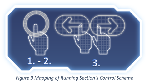
High jumps were the first thing I tried to improve with a tutorial. My idea was to create these safe spaces where the player could learn the mechanics. In the picture, we see my attempt; first, the player is introduced to the world with tons of negative space indicating the direction is to move right then the player is told through text and pausing the game to move left and right. They used this safe space to move around and learn the running controls.
A case of using the environment to afford where to jump while also using the energy blobs to signify the path to jump.
In the next part, the player learns to jump. It is the second safe space, which is fine because the shooting mechanic is so tightly fit together. Furthermore, the difficulty increases slightly because if the player does not make the jumps, they will be set back facing the other direction and they will have to try again. This creates these short iteration cycles or a loop. The first time you jump the loop starts with a realization that you can jump, the action is executed by pressing tapping the screen, the game rule triggers the maximal distance and height of the jump, and lastly the feedback: the actual jump, which again leads back to players’ renewed mental model of the jumping abilities. The way this part was constructed was for the player to test the limit of the jump. Therefore, I made the next obstacle a bit higher after each jump until reaching the max jump height.
The first time they encountered the wall-jump-challenge, they did not know they had to slam into the wall because that seems unnatural and it also looked like they could jump over the wooden fence.
The solution was to set a physical constraint on the level so that the player had to run into a collision curse with the wall. The next thing was to tell the player to jump from wall to wall. And the simple solution was to place energy blubs that was used to show the jump path earlier in the tutorial. The player instantly knew how to jump up the wall.
(The shooting tutorial. The red squares are the ground minions and the cycles flying minions. The striped line is the expected path of the minion when they have discovered the player)
In the tutorial, I play around with this idea (see picture). After the first minion is killed, the player encounters another minion facing right so it does not appear threatening. However, when the avatar is in the line of sight the minion will charge you. It will then drop down into a pit where you can shoot it from a safe distance. The game loop here is on two levels learning the shooting and the behavior of the enemies. The next minion does almost the same, however, this one falls down a pit and is eliminated. There are two reasons for this the first is that repetition is key to understanding and the second reason is not to overwhelm the player.
The fourth enemy that is introduced is a different minion. The behavior of this enemy is almost the same except it can fly and it has less health. This flying enemy will always follow until it is shot.
As a result, the playtesters in the beta enjoyed the mechanic and they easily understood the behavior and had mostly no problem pulling it off.
Overview of the first interaction map
Playtesting and tweaking the gameplay
As a UX/UI designer focused on TimeGuards, a mobile game aimed at children aged 8-13, I actively engaged in playtesting sessions with the target demographic to meticulously assess and understand the game's mechanics and character movements. During these interactive sessions, I observed and recorded how the children interacted with the game, identifying areas for improvement to enhance user engagement and gameplay fluidity.


These insights were thoroughly documented in a comprehensive UX report. Applying key UX/UI principles for games, such as intuitive navigation, clear feedback, and age-appropriate challenges, I proposed targeted optimizations. I ensured the interface was easy to navigate, reducing cognitive load for young players. I also emphasized the importance of immediate and clear feedback to keep players informed and motivated. Additionally, I focused on creating engaging yet achievable challenges to maintain their interest and encourage progression.
Based on my findings and these principles, I recommended refinements to the game mechanics, ensuring they were intuitively aligned with the needs and preferences of our young audience. These enhancements aimed to improve the overall gaming experience, making it more enjoyable and accessible for our users.
Simplified store layout for enhanced overview
Feedback from playtesting with children indicates the need for a simplified store layout. Display a single, clear list of items alongside a visible counter showing available points near each purchasable item.